


Source
Klinke, T., Christ, M., Fadl, N., Lamerz, C., & Langner, T. (2024). The effects of letter capitalization in advertising headlines. Journal of Marketing Communications, 1–23. https://doi.org/10.1080/13527266.2024.2401393
In today's episode, we dive deep into a fascinating study that challenges conventional wisdom about typography in advertising. Many marketers believe that using all uppercase letters in headlines makes ads more visually appealing and effective. But does the research support this common practice? Let's explore the surprising findings from this groundbreaking study.
Background and Prevalence
The researchers conducted a content analysis of 700 magazine advertisements across three different publications (Cosmopolitan, Runner's World, and National Geographic) in the US and Germany.
Key finding: Letter capitalization is extremely common in modern advertising and editorial content.
88% of Cosmopolitan pages
89% of Runner's World pages
60% of National Geographic pages
This prevalence highlights the importance of understanding the true impact of capitalization on advertising effectiveness.
The Surprising Impact on Legibility
Study Design:
159 US participants viewed isolated advertising headlines
Headlines were presented in either all uppercase or standard lowercase
Reading speed was measured to assess legibility
Key Findings:
Contrary to expectations, uppercase headlines took significantly longer to read
Average reading times:
Lowercase: 2.77 seconds
Uppercase: 3.16 seconds
This difference persists despite consumers' frequent exposure to capitalized text in everyday life
Implications for Marketers:
The assumed familiarity with uppercase text does not translate to improved reading speed
Using all caps in headlines may actually slow down the reader's ability to process your message
Readability in Real-World Advertising Contexts
Study Design:
168 German students viewed magazine-style ads with manipulated headlines
Variables tested:
Headline length (short: 3-4 words vs. long: 7-8 words)
Capitalization (all uppercase vs. standard lowercase)
Participants had 2 seconds to view each ad (simulating realistic exposure)
Measured ability to accurately reproduce the headline
Key Findings:
Long Headlines:
Significant negative impact when using all uppercase letters
Readers struggled to accurately recall the content of long, capitalized headlines
Short Headlines:
No significant difference in readability between uppercase and lowercase
Ad Aesthetics and Attitude:
Capitalization did not affect perceived aesthetics or overall attitude toward the ad
Actionable Takeaways:
For long headlines (7+ words): Avoid using all caps to improve readability
For short headlines: Capitalization choice has less impact, allowing more creative flexibility
Don't rely on capitalization alone to enhance the visual appeal of your ads
The Power of Selective Capitalization
Study Design:
127 participants viewed a fictitious hamburger ad
Three capitalization conditions:
All lowercase
All uppercase
Selective uppercase (key attribute "ORGANIC INGREDIENTS" capitalized)
Multiple exposures (2, 3, and 4 seconds)
Key Findings:
Selective capitalization was most effective in conveying the key product attribute
This effect was strongest in the initial exposure but persisted across multiple views
Implications: Strategic use of capitalization can direct attention to crucial information
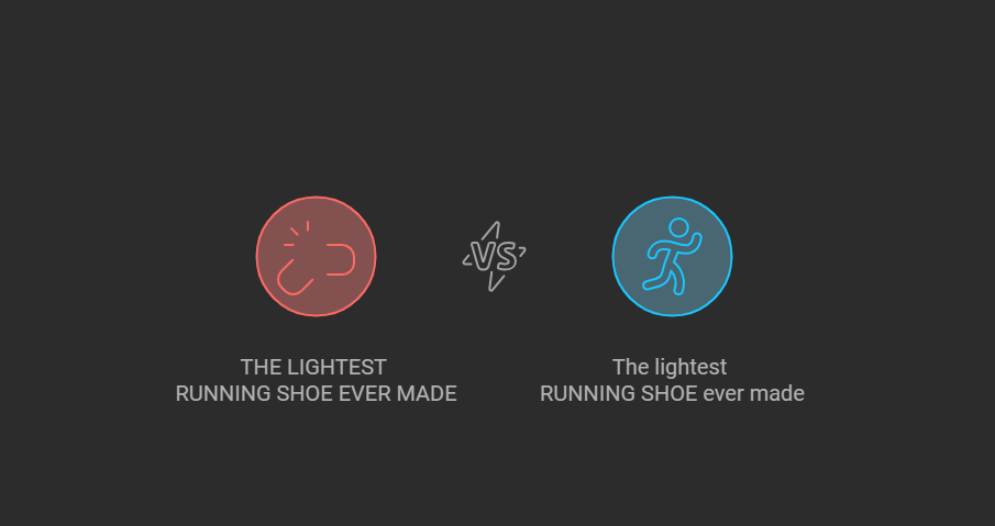
Real-World Application: Imagine an ad for a new running shoe:
Less Effective: "THE LIGHTEST RUNNING SHOE EVER MADE"
More Effective: "The lightest RUNNING SHOE ever made"
This approach allows you to emphasize the product category while maintaining overall readability.
Debunking the Myth of Uppercase Connotations
Study Design:
102 US participants viewed a tea advertisement
Headline: "Calmness for you" (in either all uppercase or lowercase)
Measured perceptions of the product's strength and power
Key Finding:
No significant difference in product perceptions based on capitalization
This challenges previous research suggesting uppercase conveys dominance or strength
Implications for Marketers:
Don't rely on capitalization alone to convey product attributes or brand personality
The overall ad context (imagery, copy, etc.) likely has a stronger influence on perceptions
Takeaways for Marketing Practitioners
Prioritize Readability: For longer headlines, stick to standard lowercase to ensure your message is easily digestible.
Strategic Highlighting: Use selective capitalization to draw attention to key product attributes or unique selling points.
Short & Sweet Flexibility: With short headlines, you have more typographic freedom – test different approaches.
Look Beyond Typography: Letter case alone doesn't significantly impact ad aesthetics or overall attitude – focus on compelling imagery and copy.
Context is King: The connotations of uppercase letters (e.g., strength, dominance) may be overridden by other visual elements in your ad.
A/B Testing is Crucial: While these findings provide general guidelines, always test different versions with your specific audience and product category.
Limitations and Future Research
The studies primarily focused on print and digital ads viewed at close-range
Further research is needed on:
The impact of capitalization in other advertising mediums (e.g., billboards, TV)
Potential age-related differences in processing capitalized text
Interaction effects with other typographic elements (font choice, color, etc.)
This research challenges long-held assumptions about the effectiveness of capitalization in advertising headlines. While the prevalent use of uppercase letters may seem visually impactful, it can potentially hinder the very goal of advertising – clear and efficient communication of your message.
By strategically employing capitalization, particularly for emphasis rather than blanket usage, marketers can enhance the readability and effectiveness of their ad copy. Remember, in the fast-paced world of advertising, every second of attention counts. Ensuring your headlines are easily digestible could make the difference between a potential customer engaging with your message or scrolling past.
Interactive Quizlet: https://quizlet.com/study-guides/magic-note-ed8f4124-9d4b-4c2d-acf5-6fa4084d9a2a?i=3i62em&x=13qt

Share this post